
How to Use the CSS clamp() Function for Responsive Design


In CSS, the clamp() function is a mathematical function that allows you to set a value within a specific range based on a minimum, maximum, and preferred value. It provides a convenient way to define a flexible value that adapts to different screen sizes or layout constraints.
The clamp() function takes three arguments: a minimum value, a preferred value, and a maximum value. The browser calculates the preferred value based on the available space but ensures it falls within the specified range. Here's the syntax:
clamp(min, preferred, max)
Here’s how I usually use it
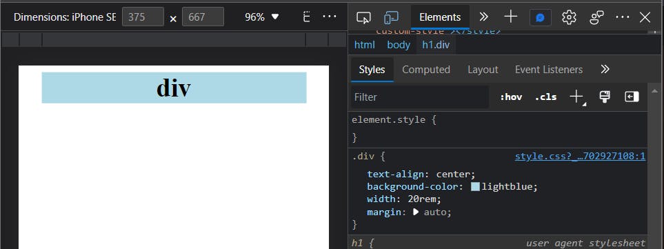
1) Mobile screen size
Test it on a mobile screen first. in this example, I use a div with a 20rem width
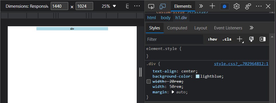
2) Desktop screen size
Now test it on the bigger screen. Comment out the previous one, and create your desired value for the big screen. In this case, I use 50rem
3) Relative unit
That was for the min and max values. Now for the preferred value I usually use 55vw which represents 55% of the viewport width
Also don't forget always to use a relative unit for the preferred value
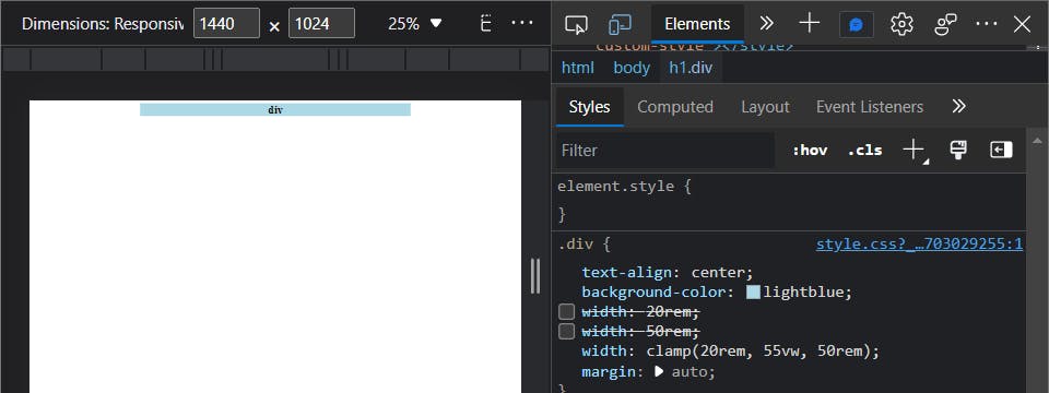
4) Clamp
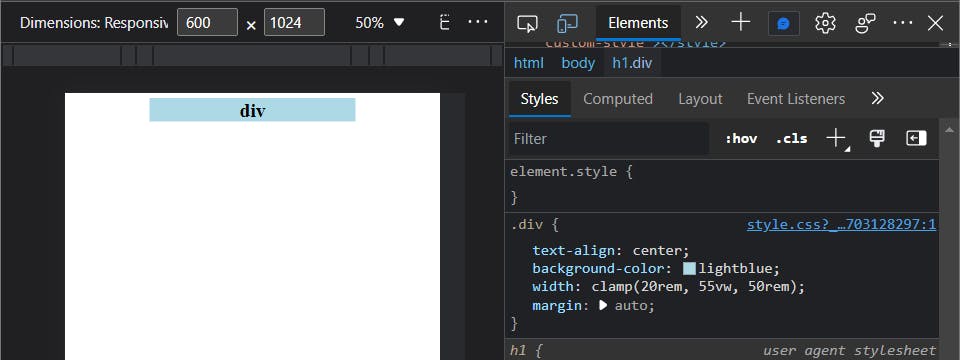
and done!
with clamp() the div width length is always 55% of the screen width but will not go smaller than 20rem and not bigger than 50rem